Where did rafiki.money go?
Written by Timea NagyIn the past few months we have come to know and love rafiki.money. So why did it disappear? Where did it go?
Fear not, rafiki.money is not gone. It just needed a facelift, a proper rebranding. Why, you may ask? We will answer everything, but first, let’s just do a quick recap:
Rafiki is open source software that allows an Account Servicing Entity to enable Interledger functionality on its users’ accounts. This includes sending and receiving money via SPSP and Open Payments and allowing third-party access to initiate payments and view transactions.
Rafiki.money was intended to be the Test Wallet application for our Test Network. It simulates an Account Servicing Entity that has integrated Rafiki. Users can sign up for an account, navigate a KYC flow (newly powered by our partner GateHub) and then hold a play-money balance to send and receive Interledger Payments. In short, it is basically a Rafiki playground.
All of the above still stands, but the need for a rebranding became obvious when some community members confused Rafiki with rafiki.money:
“I am using Rafiki, so what now?”
“I have integrated Rafiki locally. What are the next steps?”
These users were in fact using rafiki.money and they had not integrated Rafiki locally, but were using rafiki.money on their machine.
In order to help differentiate Rafiki from rafiki.money we have begun discussing ways in which we could rebrand our Test Wallet. We decided on two major changes: domain name and design. And while we are at it, we also squeezed in the same rebranding for Test E-Commerce, our own rafiki.boutique.
Introducing wallet.interledger-test.dev and boutique.interledger-test.dev
We sensed that the name rafiki.money was contributing to the confusion, so we decided to change the domain name to interledger-test.dev. You can still enjoy the same fantastic Rafiki playground, Test Wallet, at wallet.interledger-test.dev and our new boutique can be found at boutique.interledger-test.dev.

New design
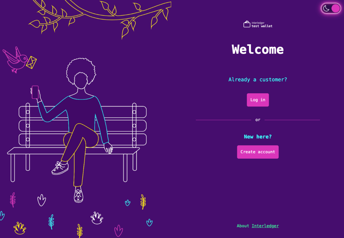
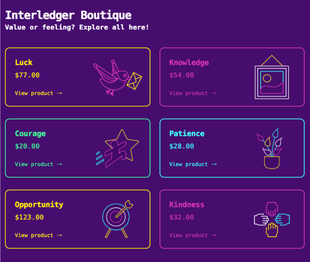
For the new design, we wanted to distinguish the look and feel of Testnet from any of the other Interledger projects. By going with a more angular and flat style, reminiscent of 8-bit or pixel-based visuals, we are hoping to express the idea that Test Network showcases products or nodes that are not fully evolved yet.
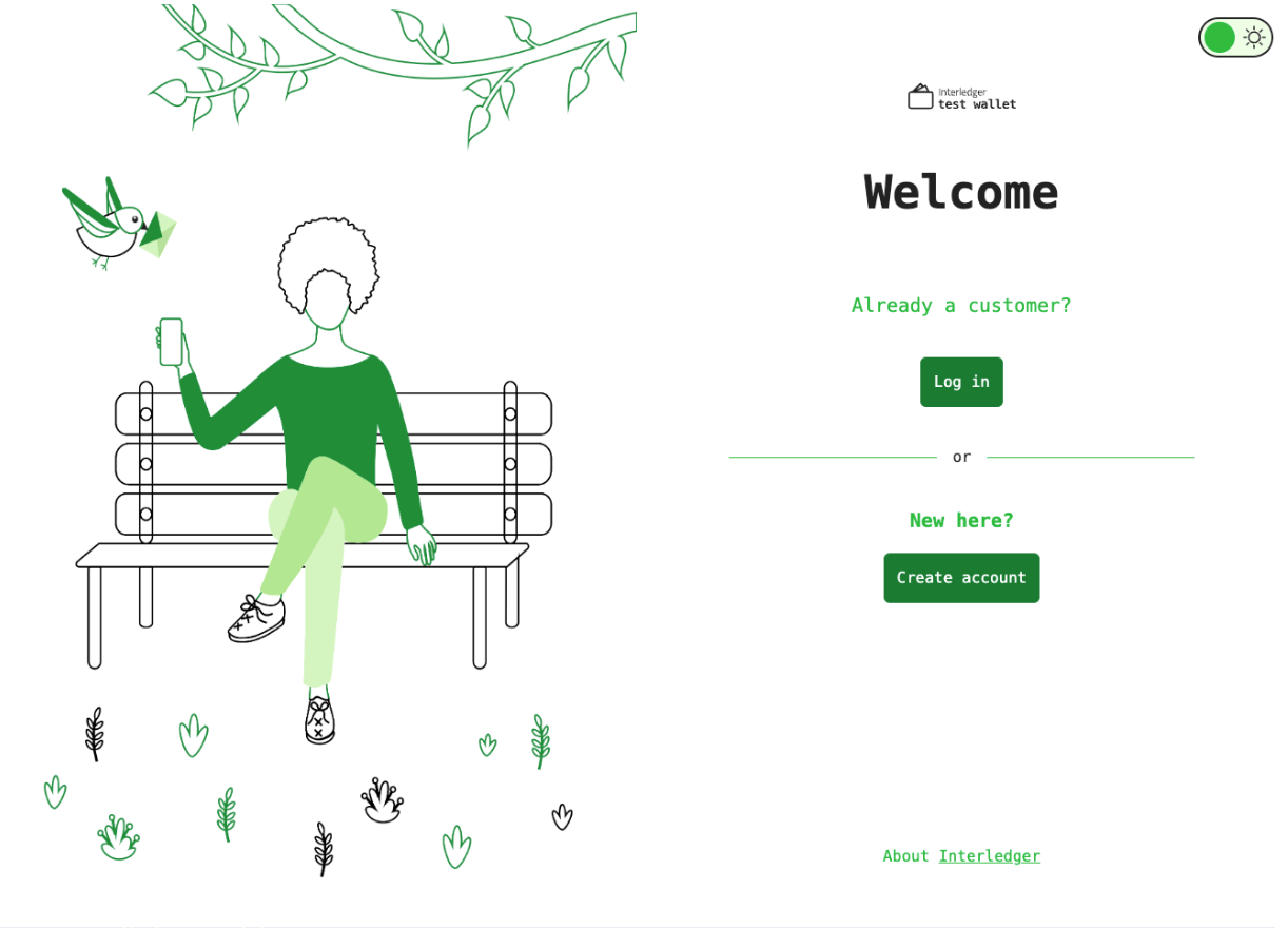
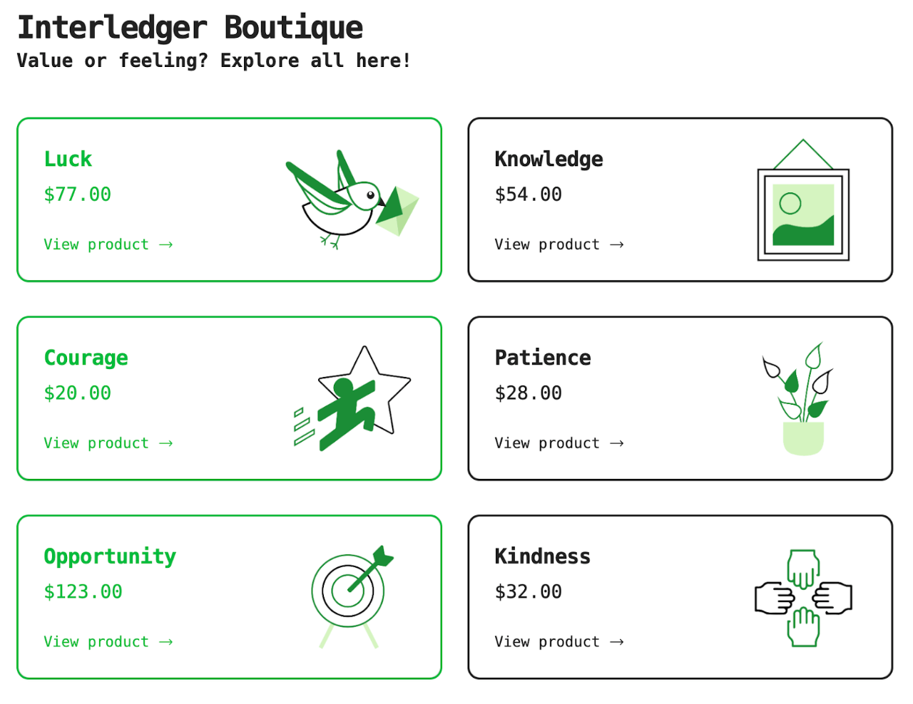
We decided to go with a dark background and neon highlights, and a monospace font with pixel-style decorative elements for the development code. We also wanted to include a light-theme version for presentation in more formal settings, or for people who prefer a light theme. For now, this will be our production enabled theme.
Upon finalizing the visuals with our in-house illustrator, Madalina Tantareanu, our handover was done via HTML mock-ups built with Astro instead of a static design file. You can even see the frontend mockups at https://testnet-mockup.surge.sh/wallet/. This allowed us to effectively check that the new design would be completely viable on a web page.
We were also able to account for designing the interactions, like hover states, which commonly get missed out if a static design file is used.
Challenges we faced, interesting stuff we used
One of the more personal challenges we faced was coming to terms with letting go of the old colorful design, which we had grown fond of and associated closely with rafiki.money and rafiki.boutique. The color scheme was too similar to Interledgers look and feel. Our aim with the new design was to entirely separate Test Wallet from the idea of Rafiki. This led to the introduction of the two new color schemes for light and dark mode. We were pleased to see that the images remained in the design, but with different color variations.
Have you seen anything like the new design before? We kind of love it!
Tailwind CSS
Now, let’s go into details on the more techy side of the design.
Tailwind CSS is a utility-first CSS framework, packed with useful classes that can be used to build any design. Test Network has already been using Tailwind CSS, as we have found that this framework meets our needs the best. We didn’t want it to be one of those websites that blinds people when they open it on their device in the middle of the night, so we fixed this by having a dark mode option to be enabled in the application. Currently, this is available only for development mode, you can check out the dark theme in our public Github repo.
Codewise it is quite easy, just throw a dark: in front of any color utility to apply it when dark mode is active. Works for background colors, text colors, borders and gradients.
The production/light mode, and development/dark mode will look like this:


Another great thing about Tailwind is that it’s tiny. It automatically removes unused CSS when building for production, so the final shipped CSS bundle is the smallest it could possibly be. It is, of course, responsive on all devices. The utility classes help us work within the constraints of a system instead of adding arbitrary values to the stylesheets. They make it easy to be consistent with color choices, spacing, typography, shadows, and everything else that make up a well-engineered design-system.
Seriously, if you haven’t tried it yet, you should!
One more major change for Test Wallet: GateHub Sandbox integration
We mentioned briefly above that we integrated the GateHub Sandbox into Test Wallet. This is a big change, as we were previously using a payments and KYC API called Rapyd. The problem with Rapyd was that we had some limitations when multiple people were using Test Wallet at the same time, as it has a rate limit. And you know we like to organize hackathons, so we always had to use workarounds to solve this problem.
In order to have many people using Test Wallet at the same time, with a much higher limitation of transactions per minute, we decided with our partner, GateHub from Ljubljana, Slovenia, that we should integrate their backend API services to handle KYC, for depositing and withdrawing play money. For our long term goals, integrating the GateHub Sandbox API is a much better solution.
The integration was a collaborative effort between the teams at the Interledger Foundation and GateHub. The GateHub team adapted their onboarding styles to ensure a seamless fit with our new design for the Test Wallet. We also implemented iFrames to incorporate GateHub’s onboarding and KYC processes, as well as the ability to deposit and withdraw play money. While the onboarding process may appear complex, it follows the standard protocol for wallet applications, especially as we aim to surprise you with Interledger cards at events.
Our initial aim was to retain all active users with registered emails on rafiki.money; however, the new GateHub integration requires existing users to complete the KYC process again and recreate their wallets along with their respective payment pointers. Due to these changes, we now require all users to have a strong password, again standard protocol for security reasons. Therefore, those who registered with rafiki.money are kindly asked to register again and create a strong password. As a result, previous wallets, payment pointers, and play money will not be accessible anymore.
Final Words
We truly hope you enjoy this new design as much as we do! We look forward to your feedback and opinion! Don’t be shy!
We put our heart and soul into making it both fun and user-friendly. So continue exploring wallet.interledger-test.dev and boutique.interledger-test.dev, and remember, we value and welcome all your feedback! Reach out to us either on Slack community channels, or open a discussion on Github Test Wallet.
As we are open source, you can easily check our work on GitHub. If the work mentioned here inspired you, we welcome your contributions. You can join our community slack or participate in the next community call, which takes place each second Wednesday of the month.
If you want to stay updated with all open opportunities and news from the Interledger Foundation, you can subscribe to our newsletter.